

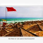
No Way In
sep. 2008
Kommentare
8


Informationen
| Sektion | Subjects: Critique - straight and tough |
| Views | 2.530 |
| Veröffentlicht | |
| Sprache |

|
| Lizenz |

|
Foto einbetten
Füge den folgenden Link in einem Kommentar, eine Beschreibung oder eine Nachricht ein, um dieses Bild darin anzuzeigen.
Link kopiert...
Klicke bitte auf den Link und verwende die Tastenkombination "Strg C" [Win] bzw. "Cmd C" [Mac] um den Link zu kopieren.
Im Messenger teilen
Füge den folgenden Link per 'Einfügen' in das Kommentarfeld der gewünschten Konversation im Messenger ein, um dieses Bild in der Nachricht zu versenden.
Link kopiert...
Klicke bitte auf den Link und verwende die Tastenkombination "Strg C" [Win] bzw. "Cmd C" [Mac] um den Link zu kopieren.
Tatjana Puc Kous 17. Februar 2011, 18:42
Fine pic!David Daneuve 17. Februar 2009, 2:01
Thanks Francisco!Francisco Gonzalez-Ruiz M. 9. Februar 2009, 17:14
Very nice photograph. Love the colors. Almost looks like an illustration. Nice work.fco.
David Daneuve 5. Februar 2009, 0:56
Danke Dirk,Grüße!
Dirk Sachse 1. Februar 2009, 0:34
Klasse!Gruss,
Dirk
David Daneuve 28. Januar 2009, 16:22
Hi Patrick,First of all I want to thank you for your interest and for your opinions.
On the other hand, yes I like sharpening some of my images, but not all and not excessively.
Some pictures need a litle bit more sharpening, for a “dramatic” effect, some don’t.
In this particular case, it was stormy and windy. The red flag and the empty beach needed to be “accentuated” and I chose to use a tonal contrast.
Mabe it is not the best choice, I accept that.
I will post another image, with another athmosphere for you to see that over-sharpening is not dominant in my work.
Regards,
David
Patrick Chuprina 28. Januar 2009, 15:13
Hi David,Another image I love. Your presentation is so clean, so good. In reviewing your three last posts I just can't help but wonder if you are oversharpening your images. It's really hard to tell, I'd love to know what you and any other viewers think.
I often deal with that problem myself with my images, and would love some input.
Matthias Moritz 28. Januar 2009, 7:33
very stylish