
Kommentare
29


Informationen
| Sektion | Reise: San Francisco |
| Ordner | USA |
| Views | 1.790 |
| Veröffentlicht | |
| Sprache |

|
| Lizenz |
Foto einbetten
Füge den folgenden Link in einem Kommentar, eine Beschreibung oder eine Nachricht ein, um dieses Bild darin anzuzeigen.
Link kopiert...
Klicke bitte auf den Link und verwende die Tastenkombination "Strg C" [Win] bzw. "Cmd C" [Mac] um den Link zu kopieren.
Im Messenger teilen
Füge den folgenden Link per 'Einfügen' in das Kommentarfeld der gewünschten Konversation im Messenger ein, um dieses Bild in der Nachricht zu versenden.
Link kopiert...
Klicke bitte auf den Link und verwende die Tastenkombination "Strg C" [Win] bzw. "Cmd C" [Mac] um den Link zu kopieren.
Der Lino 5. April 2006, 22:35
Eine tolle Idee sehr schön umgesetzt.Patrick B. Parenteau 3. April 2006, 23:16 Voting-Anmerkung
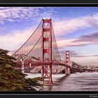
A lot of editing work has gone into this image creating a unique perspective from a very common shot. However, he didn't finish the job. Like Jeremy said, if you look between the cables, the sky is different in colour and saturation. I like the postcard feel to the shot and look forward to seeing the finish product some day. - contra.Valfoto 3. April 2006, 23:16 Voting-Anmerkung
I see the colours of this architecture's pic too much agressive........I lke the composition, but sorry contra
JVision 3. April 2006, 23:16 Voting-Anmerkung
skipDominic Falcone 3. April 2006, 23:16 Voting-Anmerkung
I like it a lotPro
Der Zacki 3. April 2006, 23:16 Voting-Anmerkung
contraWhen 3. April 2006, 23:16 Voting-Anmerkung
I've seen a hundred of the bridge from this exact angle. At least it has a different feel and look. I like how it's presented.Viktoria Shorite 3. April 2006, 23:16 Voting-Anmerkung
Sorry... for me looks the pictoo unnatural... skip/conraCees Kuijs 3. April 2006, 23:16 Voting-Anmerkung
skipJeremy B 3. April 2006, 23:16 Voting-Anmerkung
My contra comes because the editing on the sky stops when it reaches the bridge. The sky between the suspension cables is very noticeably a different color.Abdul Khaliq 3. April 2006, 23:16 Voting-Anmerkung
Thanks for the translation Heinz :))55% pro for composition & 45% contra for noise on sky.It's PRO then.
Seagaul 3. April 2006, 23:16 Voting-Anmerkung
Editing is good, like it !Dennis Veldman 3. April 2006, 23:16 Voting-Anmerkung
ok guys, here goes : i translated via : www.freetranslation.com"Because the resonance and the interest of the San Francisco series of was very large, I grasped the decision to release this picture because of the beautiful subject to the voting"
"Values please impersonally and fairly."
I vote PRO. its one of a kind.
Roberto Grilli 3. April 2006, 23:16 Voting-Anmerkung
I like it and don't have to wait for the translation of the proposal.pro
Ivano Cheli (1) 3. April 2006, 23:16 Voting-Anmerkung
pro