
Bie Brücke...
.... über den grossen Belt.
Kommentare
16


Informationen
| Sektion | Reise: Norway |
| Views | 692 |
| Veröffentlicht | |
| Sprache |

|
| Lizenz |
Foto einbetten

Füge den folgenden Link in einem Kommentar, eine Beschreibung oder eine Nachricht ein, um dieses Bild darin anzuzeigen.
Link kopiert...
Klicke bitte auf den Link und verwende die Tastenkombination "Strg C" [Win] bzw. "Cmd C" [Mac] um den Link zu kopieren.
Im Messenger teilen
Füge den folgenden Link per 'Einfügen' in das Kommentarfeld der gewünschten Konversation im Messenger ein, um dieses Bild in der Nachricht zu versenden.
Link kopiert...
Klicke bitte auf den Link und verwende die Tastenkombination "Strg C" [Win] bzw. "Cmd C" [Mac] um den Link zu kopieren.
Marcel Krüger 27. September 2005, 15:10 Voting-Anmerkung
@Vladimar:>Just think how many voters didn't write at all. That's the thing we should pay attention for.
Exactly, that's what I meant.
Costantinos Milonas 27. September 2005, 15:10 Voting-Anmerkung
Pro !!!Vladimir Danilov 27. September 2005, 15:10 Voting-Anmerkung
Hello, Marcel.Another big master of photography here claimed that I do not reason my votes, you claim just in the contrary.
I will write the way I want to, Punkt! If other people have nothing to add after reading my comments, that could mean I had expressed everything they would say. If they would have not agreed, they could write this. Just think how many voters didn't write at all. That's the thing we should pay attention for.
Mit freundlichen Gruessen,
Vladimir
Marcel Krüger 27. September 2005, 15:10 Voting-Anmerkung
Hello Vladimir,I can follow your way of reasoning. I think it's great that you took the time to reply extensively and make your point. Please don't get me wrong on this, my remark was not meant to be an attack on your view/opinion/remark. You presented your view and even commented on it. That's great, that's alot more than most of us do. But I've noticed, that if you have such an extensive remark at the beginning of a voting process, people read it, and without making up their own minds about the picture, they just subscribe to it. Again, I don't want to say, that all who wrote "agree with Vladimir" are doing that, but I think there is a strong tendency there... And that's basically what I don't like. You made your point and explained it. But if you had not done this, other people could not write "agree with Vladimir" but they would have to present their own arguments...or maybe they agree with you on some points (as myself) but not on all point, but all they write is "agree with vladimir"... so that's the point that bothers me here...
I still love that pic and can look at it again and again without getting tired of it, and if Thomas has more fine pictures (I have to admit I havn't looked into his set yet), that's fine, but I do like this one.
Greetings
Marcel
Vladimir Danilov 27. September 2005, 15:10 Voting-Anmerkung
Marcel Krüger, 16.09.2005 at 17:21hIs your critism always sharp, or only because the pic is from Thomas?
HAVE YOU SEEN HIS OTHER WORKS? HE IS A MASTER IF AND WHEN HE WANTS TO BE IT. THIS ONE IS NOTHING MORE, IMHO, THAN A VERY WELL CAPTURED TRIP SCENE. THOMAS WEBER IS IN MY PERSONAL LIST SINCE THE BEGINNING.
1) I agree on that one
2) If it's not broken, don't try to fix it: Why overly saturate the sky, it's not the main motive of this picture?
I WROTE ''IMHO''. SO FAR THE SKY TAKES OVER 60% OF THE PHOTO AND IS THE BACKGROUND OF THE SCENE, IT SHOULD BE EDITED, TOO (IMHO)
3) Yes, the horizon is not straight. One could argue he could have straighten it out, but what is the point with the back of the ship? The back of the ship is never straight, I really don't get your point there, please explain this one for me
YOU AGREED, YOU SEE? I WOULD NOT LIKE TO DISCUSS ABOUT EVERY OF 3 LINES HERE, THEIR COMBINATION DISTRACTS ME TO GIVE A PRO.
4) I love that sky. Why crop it away? You loose that feeling of space that he certainly had when standing on that ship... IMHO panoramic shots only make sense, if that's the only way you can capture a scene, why reduce the picture to that size?
EXACTLY - IMHO
Once again, it's not about that I want too much from Thomas, it's all about the choice for the proposal
the pic below is in my "Favorite" list.
Tirol en sepia (4/4)
Thomas Weber IIAlin Neamtu 27. September 2005, 15:10 Voting-Anmerkung
I vote pro. The lines aren't perfect but I see an good ideea... For me the ideea works more than some technique imperfections...IMHO.Kay Wölfle 27. September 2005, 15:10 Voting-Anmerkung
Hi Thomas,it´s a contra for me. Let me explain:
The horizon is not straight. In pictures like this for me it´s mandatory to have a straight horizon (e.g. it also shows in the bridge).
The Sky is a little bit boring, because of it´s haziness.
The foreground is too busy, with no clear structure
Greetings Kay
Karl Louis 27. September 2005, 15:10 Voting-Anmerkung
contra(horizont, sharpness, frame)
Marcel Krüger 27. September 2005, 15:10 Voting-Anmerkung
I'm very surprised about this kind of discussion here...and maybe I'm the only person in the universe that does not agree with Vladimir - if that is so, it's certainly not because of dislike of his person or his works....but:
I don't understand the introduction: Is your critism always sharp, or only because the pic is from Thomas?
1) I agree on that one
2) If it's not broken, don't try to fix it: Why overly saturate the sky, it's not the main motive of this picture?
3) Yes, the horizon is not straight. One could argue he could have straighten it out, but what is the point with the back of the ship? The back of the ship is never straight, I really don't get your point there, please explain this one for me
4) I love that sky. Why crop it away? You loose that feeling of space that he certainly had when standing on that ship... IMHO panoramic shots only make sense, if that's the only way you can capture a scene, why reduce the picture to that size?
Sorry, I recommended that pic, and you will excuse if I speak up for it now.
† wovo 27. September 2005, 15:10 Voting-Anmerkung
agree also with Vladimirsorry, contra
Anastasiya Ivanova 27. September 2005, 15:10 Voting-Anmerkung
emm....Vladimir Danilov 27. September 2005, 15:10 Voting-Anmerkung
Hi, Thomas.Nice to see that one of your works has been proposed for he Gallery. Now get ready, my criticism on your photo will be sharp... 8-))
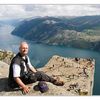
1. The first general perception - stunnning view, clever captured and composed.
2. The sky, IMHO, could be more saturated or darkened (It looks almost blended due to the white clouds). Normally I do this in PS in "Image-Adjust-Highlight/Shadows"
3. Strange play of the horizont line, bridge and ship back. Yeah, I understand that you could align only the horizont, and the angle of shooting was like it was, but all these lines are not beautyfully paralell for me.
4. IMHO, I would cut off the half of the sky from upper part to reach more panoramic view.
I think, you accept my criticism in right way. I´ve seen some very professional photos from you in COM and DE.
Contra and good luck by voting!!!
Gruß!
Valdimir
Marcel Krüger 27. September 2005, 15:10 Voting-Anmerkung
I love the composition of this picture, the trail of the ship gives you a sense of distance... you look at the picture and it makes you feel as if you're right there.Manfred Lang 15. September 2005, 21:04
Das Bild war doch schon einmal hier vor einigen Tagen!?Wurden die Pfeiler gerade gerückt? - Oder?
Interessante Gesamtinszenierung!
Herzliche Grüße
Manfred
Thomas M. Weber 15. September 2005, 20:42
@Ingo: Und ? War Super, oder? Wann genau bist du da mitgefahren??@Olli: Lade doch mal deine Frau auf ein Wochenendtrip nach Oslo ein. Habe neulich ein Angebot gesehen für 150 Euro mit 2x Frühstück.